Reimagining the ACS Publications Article Page
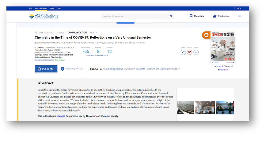
← Before
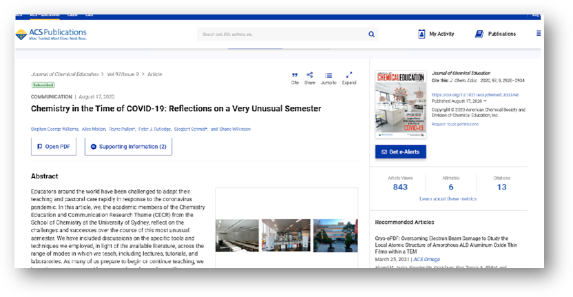
After →
Helping researchers discover more without leaving the article page
Researchers often landed on an article page to read a single paper, but many left the site immediately afterward to continue searching elsewhere. While the page included tools designed to encourage further exploration, features like recommended articles and subject-based navigation were underused.
I led a mixed-methods initiative to understand how researchers interacted with the article page, identify opportunities to improve discovery, and evaluate whether a redesigned experience better supported their workflow.
My responsibilities included:
Stakeholder Workshops
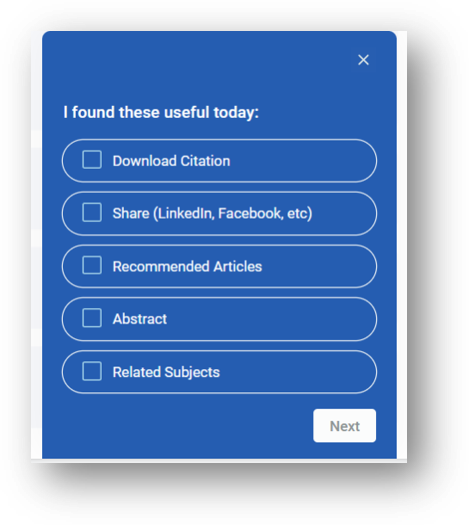
Hotjar Surveys
User Interviews
UI Design Updates
Figma Prototyping
Usability Testing
Maze Analytics
Dovetail Analysis
Phase One: Understanding the Existing Experience
To understand current behaviors, I combined quantitative and qualitative research methods.
Hotjar In-Page Survey
Collected feedback on which page elements users found most valuable.
Commonly discussed features included:
Abstract
Download Citation
Article Metrics
User Interviews
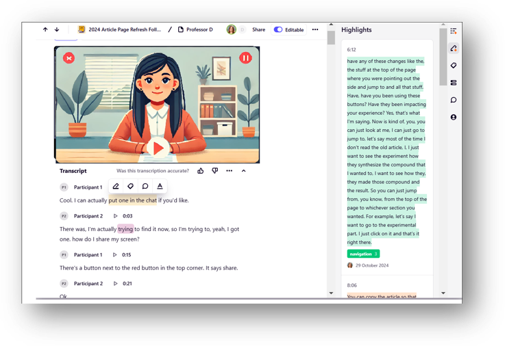
I conducted sixteen virtual interviews with researchers.
Sessions were transcribed and analyzed in Dovetail to identify recurring themes and usability issues.
This combination of behavioral and attitudinal data gave us confidence that we understood not only what users were doing, but why.
From Research to Design
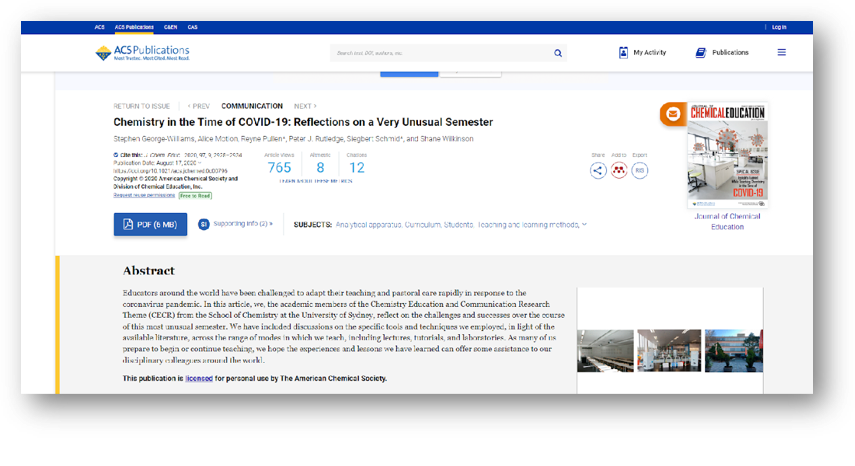
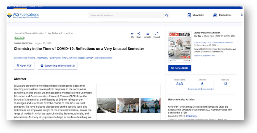
Research showed that several valuable discovery features were difficult to find or competed visually with higher-priority content.
Working in Figma, I reorganized the article page to create a clearer visual hierarchy and a prototype for testing.
Key improvements included:
Bringing Recommended Articles closer to the primary reading experience
Reducing visual competition from secondary information
Improving overall navigation and scanability
Phase Two: Validating the Redesign
Rather than assuming the redesign was successful, I tested it.
Guerrilla Usability Testing
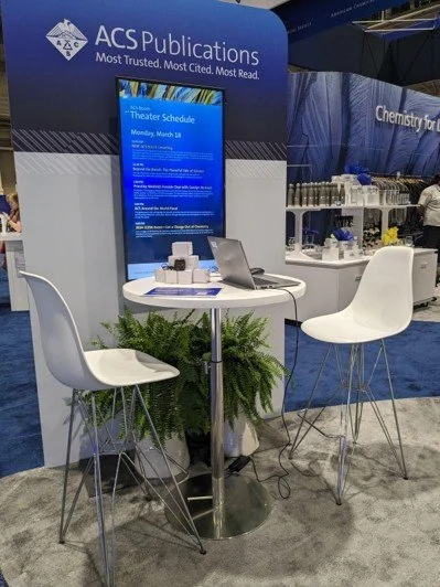
At the ACS Fall Conference, I recruited 21 participants across two days.
Maze captured task completion and time-on-task metrics while participants completed realistic research tasks.
Follow-up Survey
I gathered additional feedback using another Hotjar survey focused on the redesigned page.
Follow-up Interviews
Six researchers who had noticed the redesign participated in interviews to better understand how the changes affected their workflow.
Results
The redesigned experience significantly improved discoverability.
Recommended Articles
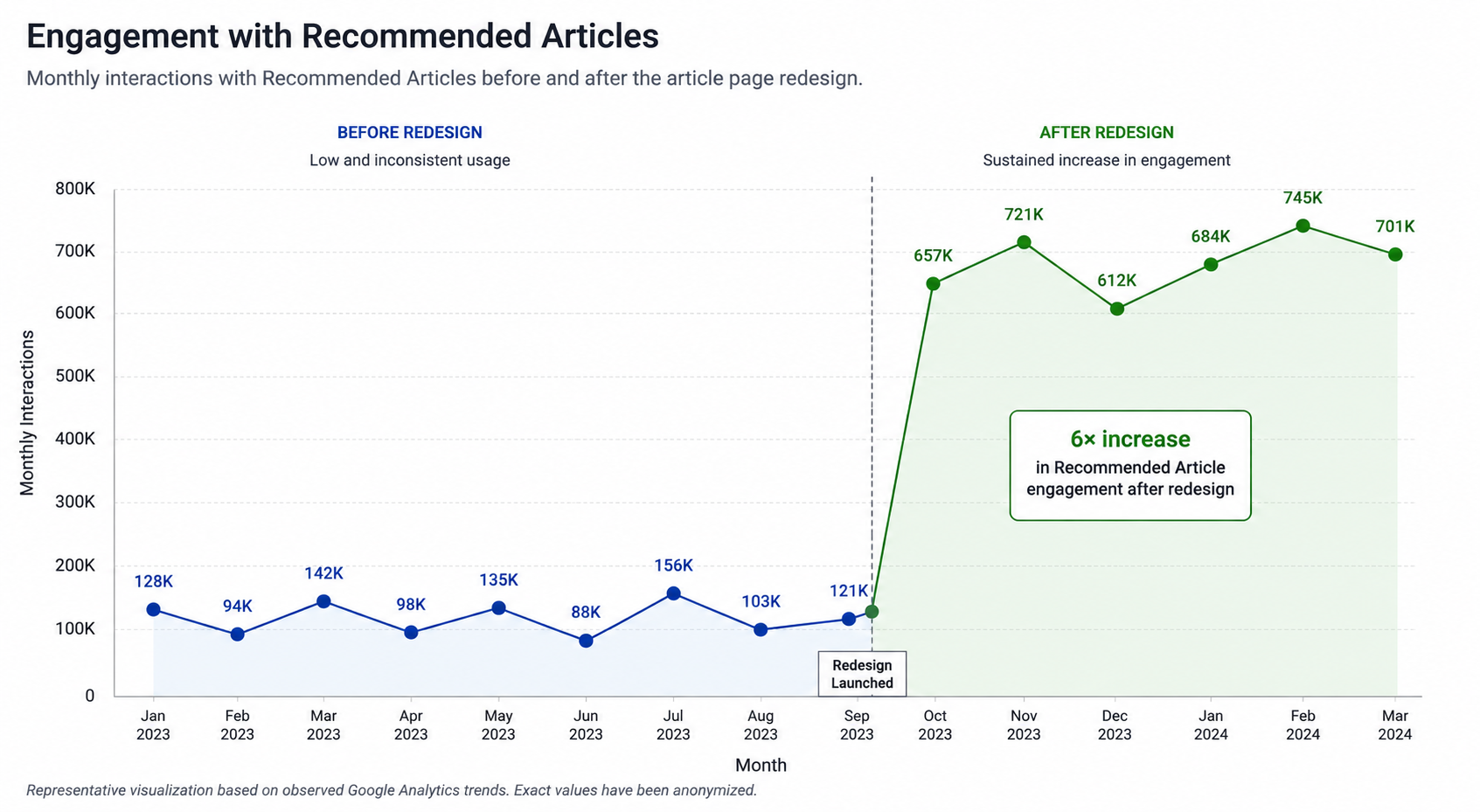
Usage increased 6× after moving the section higher on the page.
Researchers told us that having related articles immediately available made it easier to continue exploring without scrolling.
"Having recommended articles at the top is convenient and efficient."
Better Reading Experience
Users appreciated that article metrics were still available but no longer distracted from the primary content.
"The metrics are still available but moved to the side, allowing the focus to be on the article."
Overall Satisfaction
Participants consistently described the redesign as:
More informative
Easier to navigate
Better organized
Reflection
This project reinforced an important lesson for me: improving discoverability isn't about adding more features. It's about making the right information available at the moment users need it.
By combining stakeholder alignment, behavioral analytics, qualitative interviews, and iterative usability testing, we were able to move beyond assumptions and make design decisions grounded in real user behavior. The follow-up research validated that even relatively small changes to information hierarchy could have a meaningful impact on how researchers explored content.