Designing for Complex Operational Workflows
Simplifying a high-frequency administrative workflow for a Navy application
The Challenge
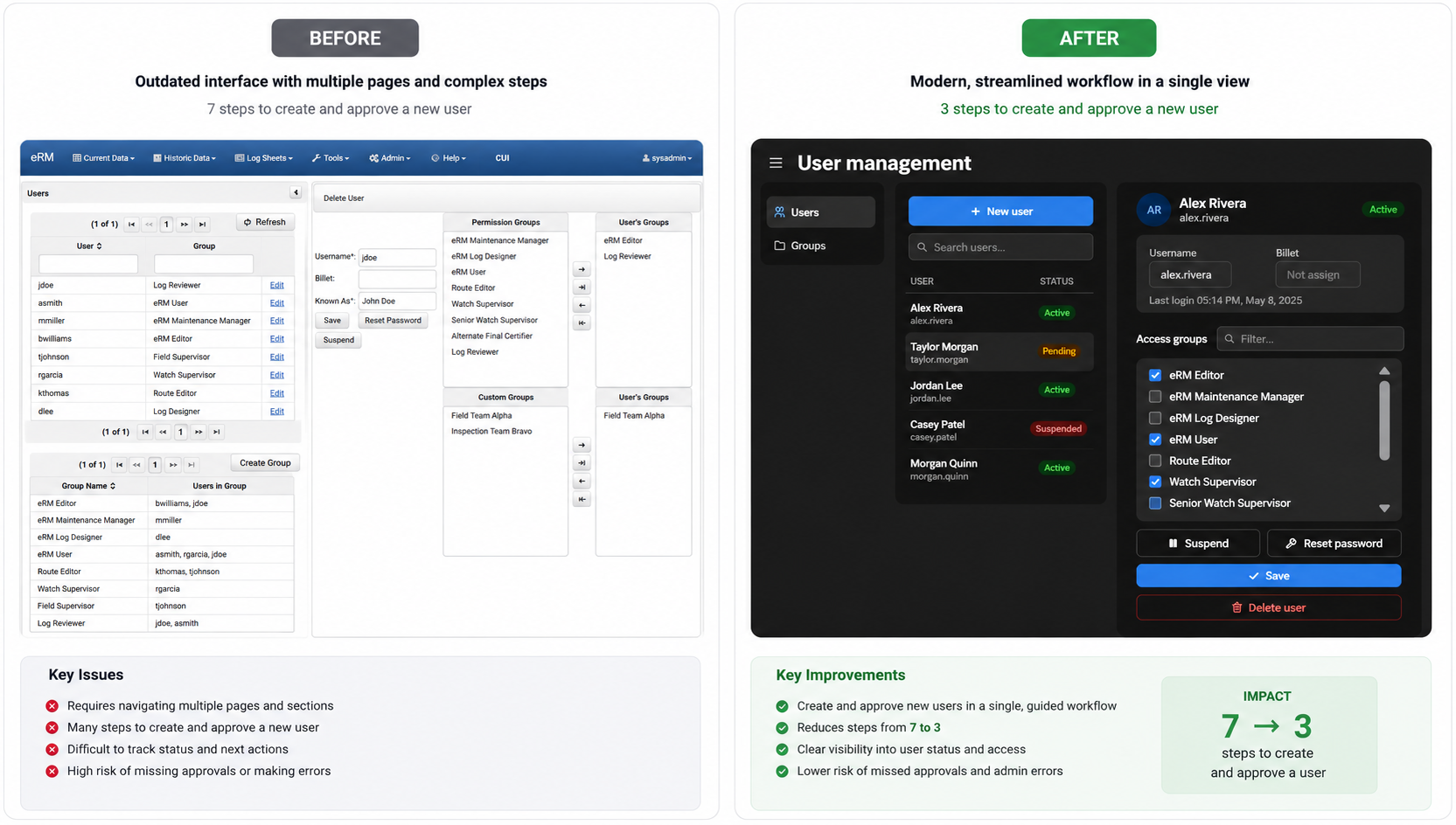
In operational software, even routine administrative tasks can become surprisingly complex.
Administrators responsible for creating and approving new user accounts had to navigate a fragmented workflow that required repeatedly switching accounts and moving between disconnected screens. While each step served a purpose, the overall experience increased cognitive load and made it easy to lose track of pending approvals.
My goal was to reduce unnecessary complexity while preserving the existing security model.
My Responsibilities:
UX Research
Workflow Analysis
UI Design
Stakeholder Collaboration
Prototype Design
Understanding the Workflow
Rather than immediately redesigning screens, I focused on understanding how work actually flowed through the system.
Research Activities
Interviewed six administrators
Collaborated with the product owner
Reviewed technical constraints with developers
Mapped the existing workflow
What I Learned
Administrators consistently described friction caused by:
frequent context switching
repetitive navigation
uncertainty about what required action
difficulty keeping track of pending approvals
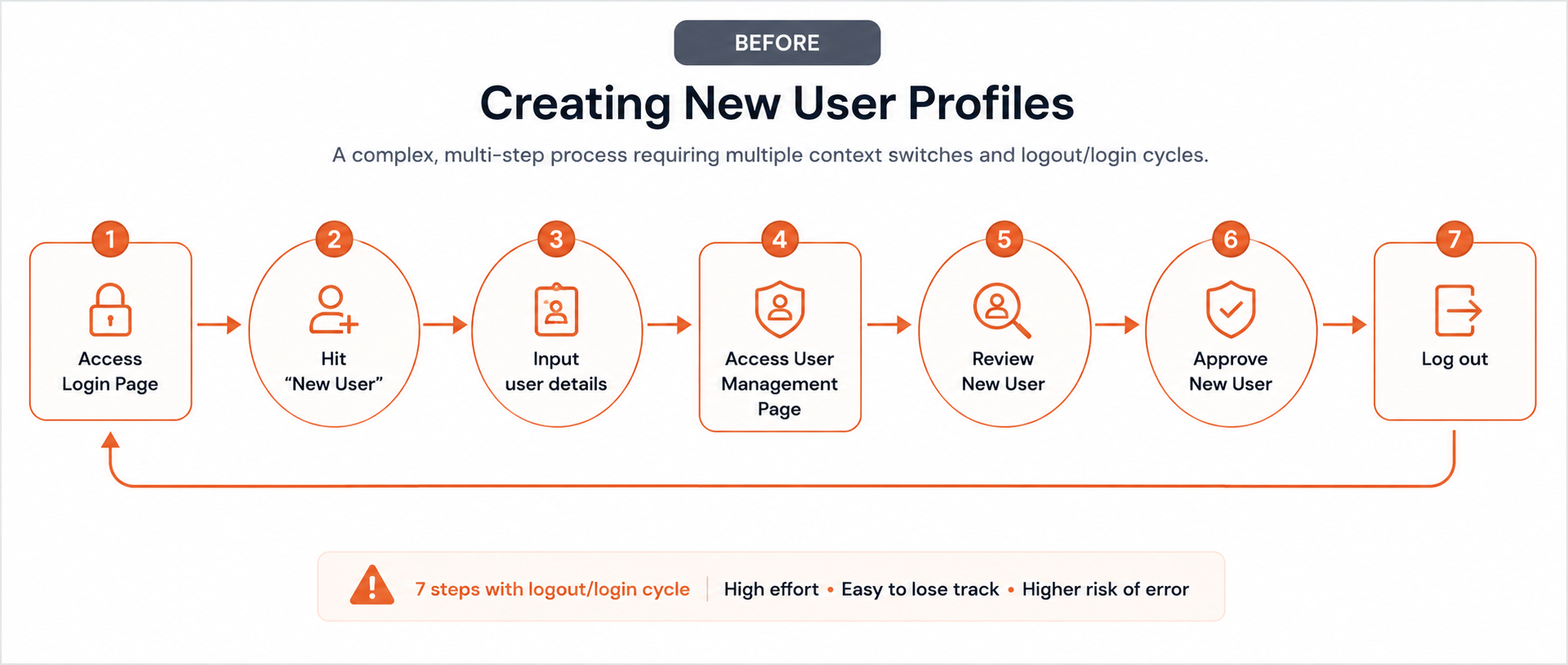
The original workflow required seven separate steps to create and approve a new user.
Because responsibility shifted between different roles, administrators were required to repeatedly change context before completing what should have been a simple task.
Design Goals
The redesign focused on four objectives:
Reduce the number of required steps
Minimize context switching
Increase visibility into workflow status
Reduce opportunities for administrative error
Impact
Workflow Improvements
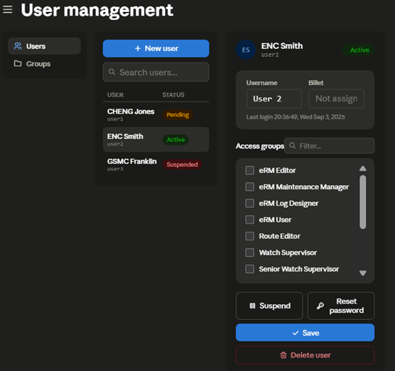
Reduced new user creation from 7 steps to 3
Eliminated repeated login/logout cycles
Reduced context switching
Improved visibility into approval status
Simplified one of the application's most frequently performed administrative tasks
Reflection
This project reinforced an important lesson:
The biggest usability problems aren't always found on individual screens. They're often hidden in the transitions between them.
By stepping back and examining the entire workflow instead of isolated interfaces, I was able to remove unnecessary complexity while supporting the operational requirements of the system.